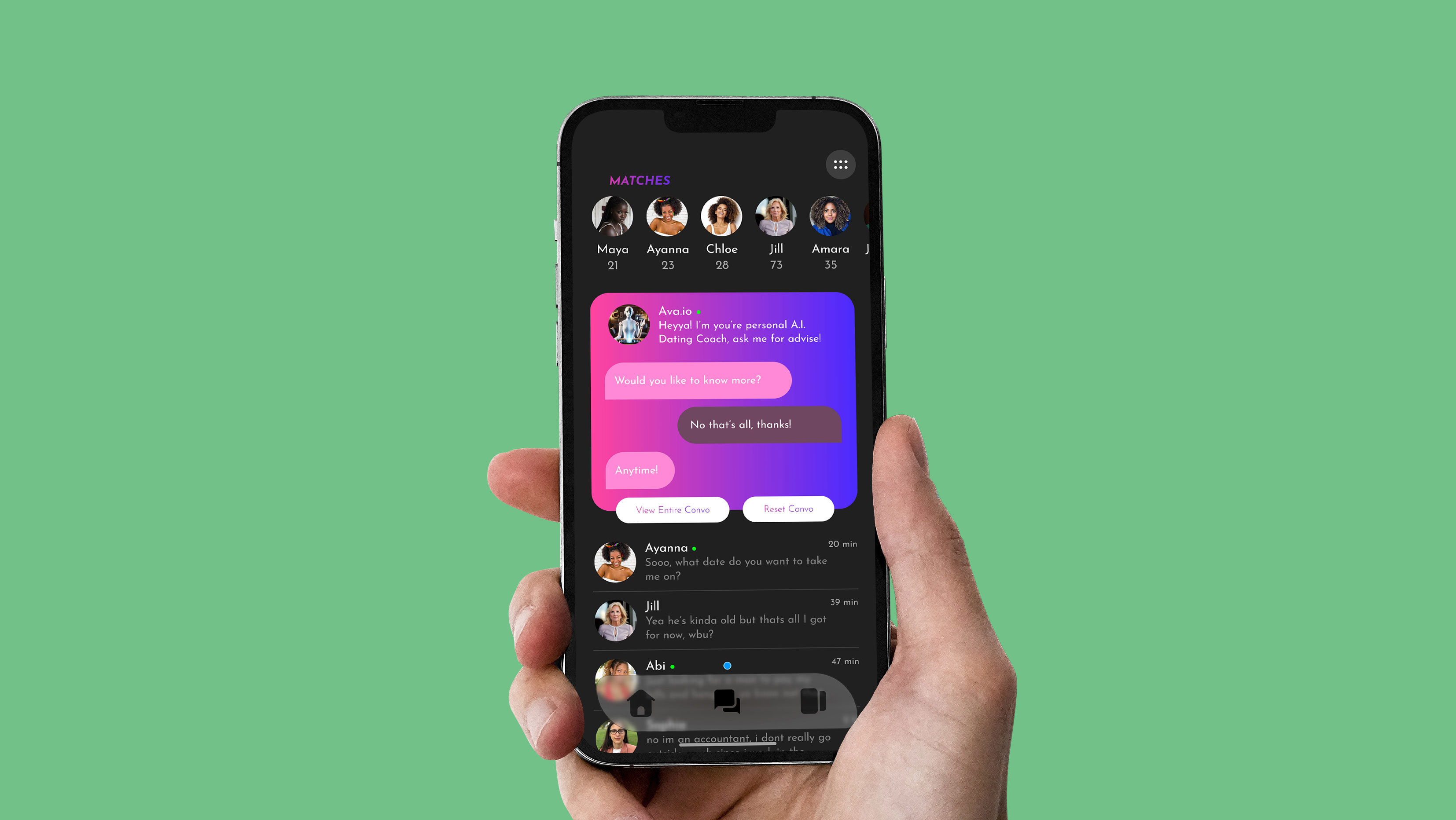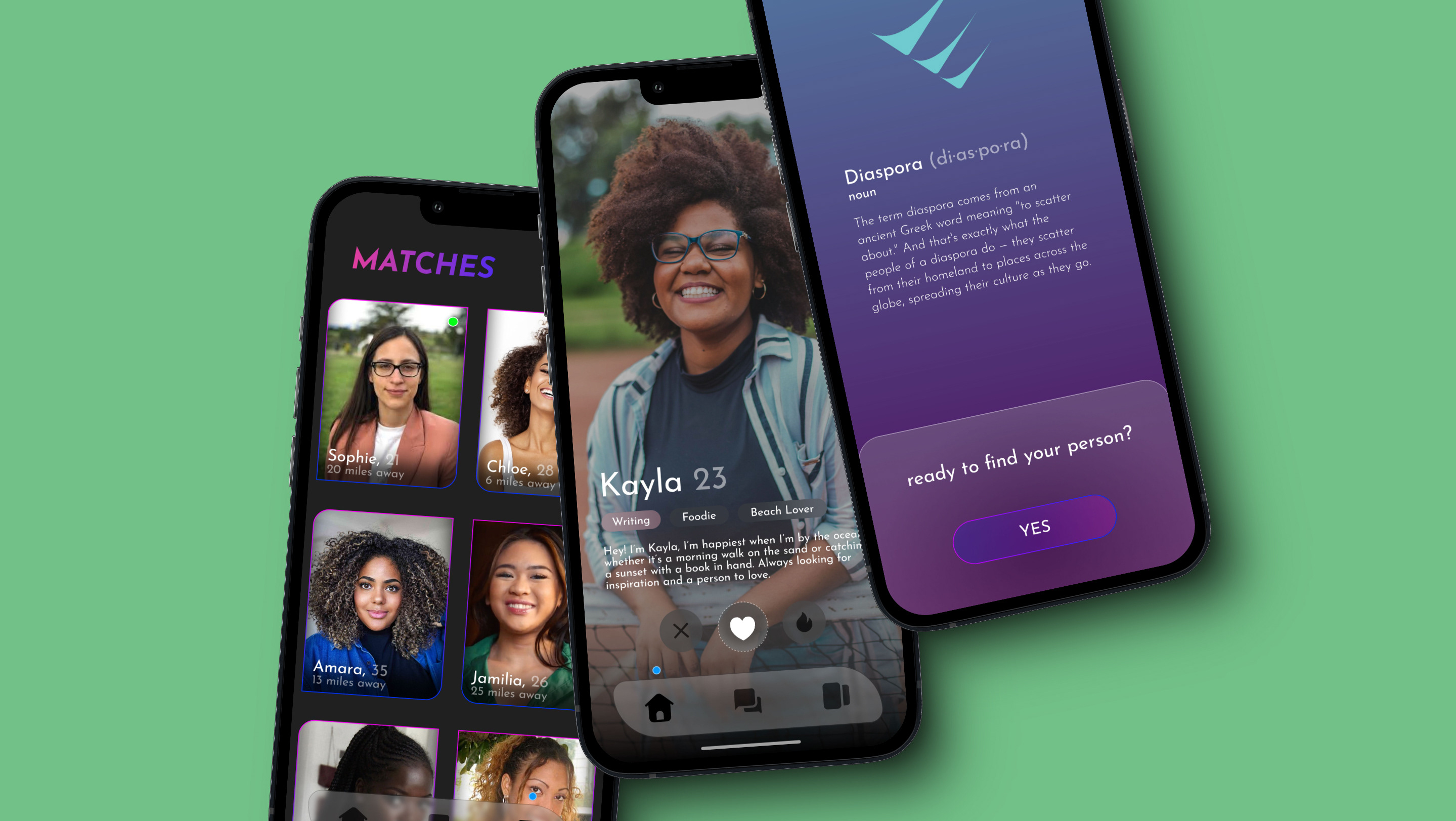

CORE CREDIT™ is a User Experience & User Interface project meant to assist users with their credit journey. The features include monitoring credit scores, setting goals, auto-generated tips, budgeting, and many more.
RESPONSIVE DIMENSIONS
March 2024 - April 2024
In this 80 hour design challenge, I undertook a UX design project focused on curating a new innovative way to not only monitor one's credit score journey, but also assists in generative-tips, budgeting, setting financial goals, and many more lucrative functionalities. This case study unfolds the narrative of research, design, and testing to address the unmet need for a higher quality path to accommodate for new or familiar credit score users.
.Overview
The Challenge
To design an innovative and interactive financial wellness platform that assists users in managing their credit scores, budgeting, learning financial tips, and setting & achieving financial goals while becoming financially free. The app should provide a comprehensive yet user-friendly experience that simplifies complex financial concepts and promotes positive financial habits, especially for new credit users.
The Goal
To develop an interactive financial wellness application that empowers users to take control of their financial health by most importantly improving their credit scores. The app should provide seamless, engaging, and educational experience that fosters financial literacy & discipline.
My Role
User Research, Visual Design, Information Architecture, UX/UI Design, Prototyping, Usability Testing.
Tools Used
Figma, Photoshop, Illustrator, Chatgpt
.Process
Research
Information Architecture
Wireframe
Prototype
Test
Iterate
.Research
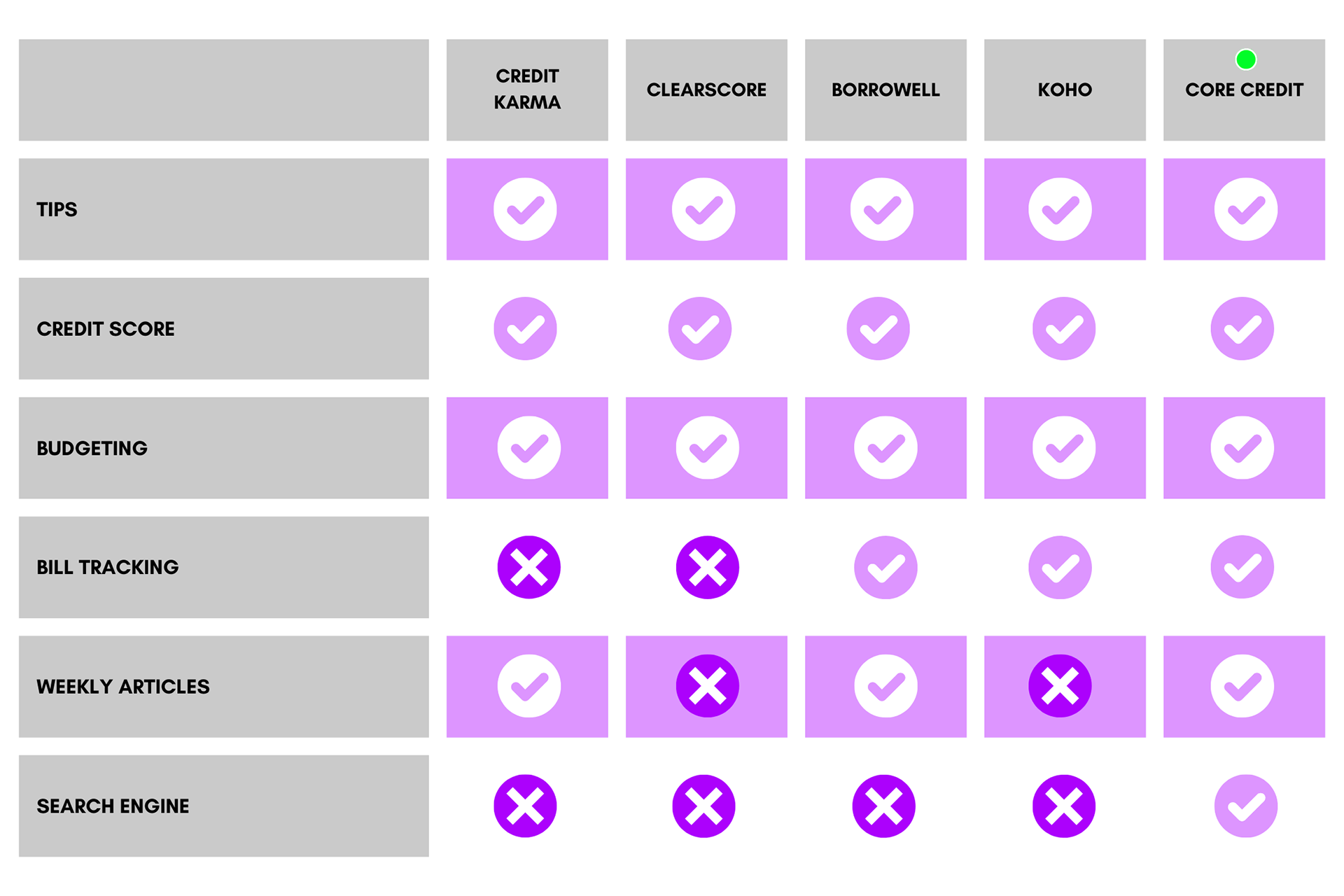
Ramp Up
Before I submerged into any research, I needed to first understand more about how credit scores are visualized & look who the target users would be. I started this with table graph comparing multiple credit score & bank apps to get a bigger idea of where to begin on this journey.
User Interviews & Surveys
Engaging in confidential conversations with users, I uncovered a demand in goal setting, user-friendly interfaces, and educational resources.
Research questions asked:
• What prompts you to check your credit score?
• Do you understand all the sections of your credit report provided by the app?
• How helpful are the auto-generated tips & advice for improving your credit score?
Valuable insights included:
• High demand for a visual representation of data.
• Users (especially newer generations) are in constant confusion of how to use their credit score to it's fullest potential.
• Users would rather be told what to do than be given vague informatives.
.Focus
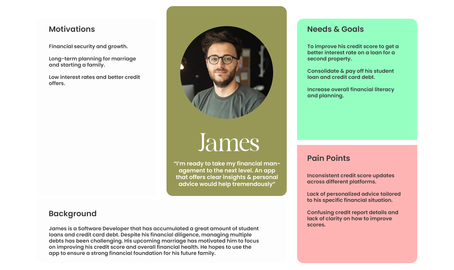
I started planning & focusing on the parameters of the new app.
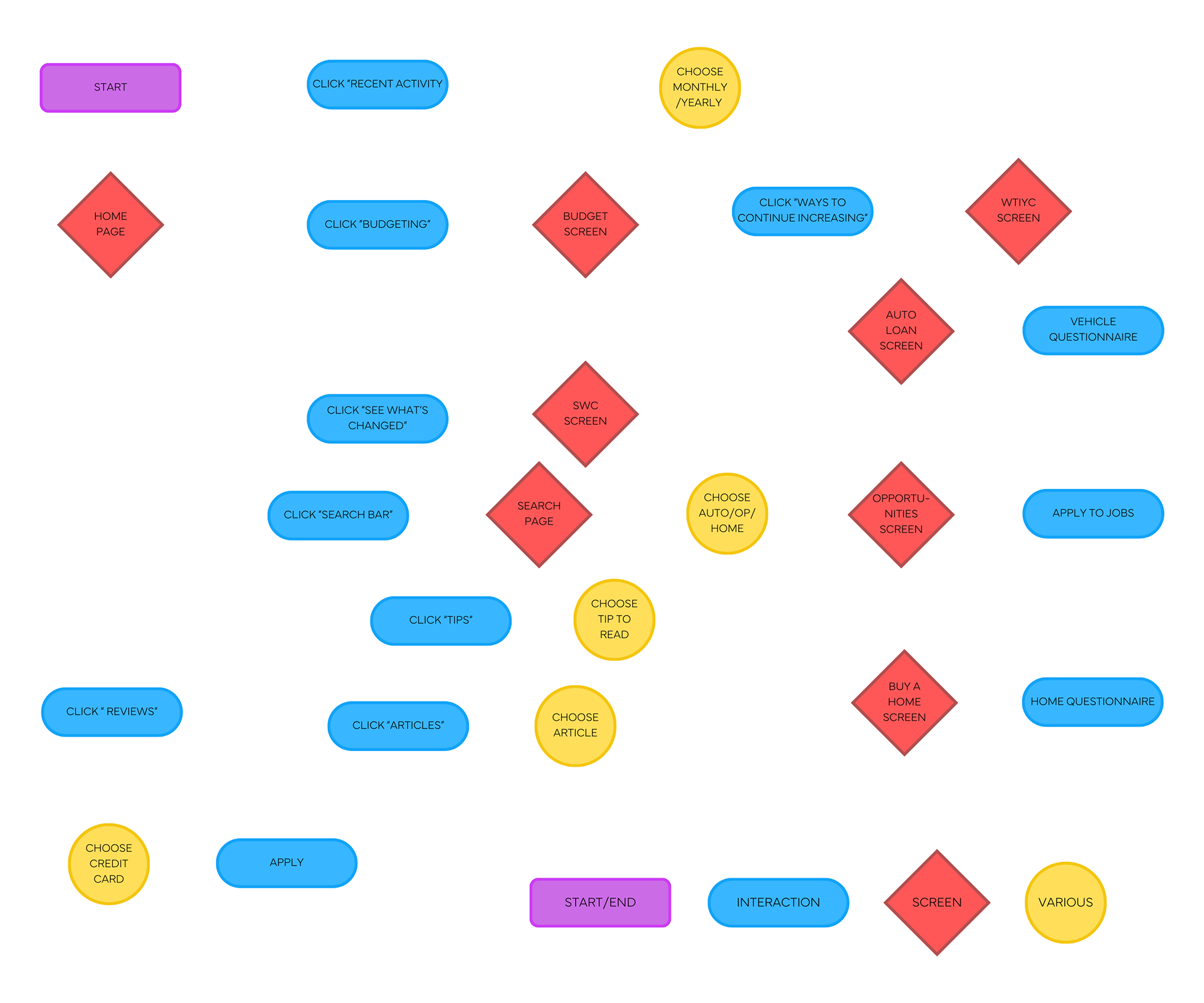
• Created a user persona (James) based on research findings.
• Developed a product user flow, providing a clear path through the product for users.
James, a 31-year-old Software Developer in San Francisco, became the "guinea pig" for the design decisions.
.Design
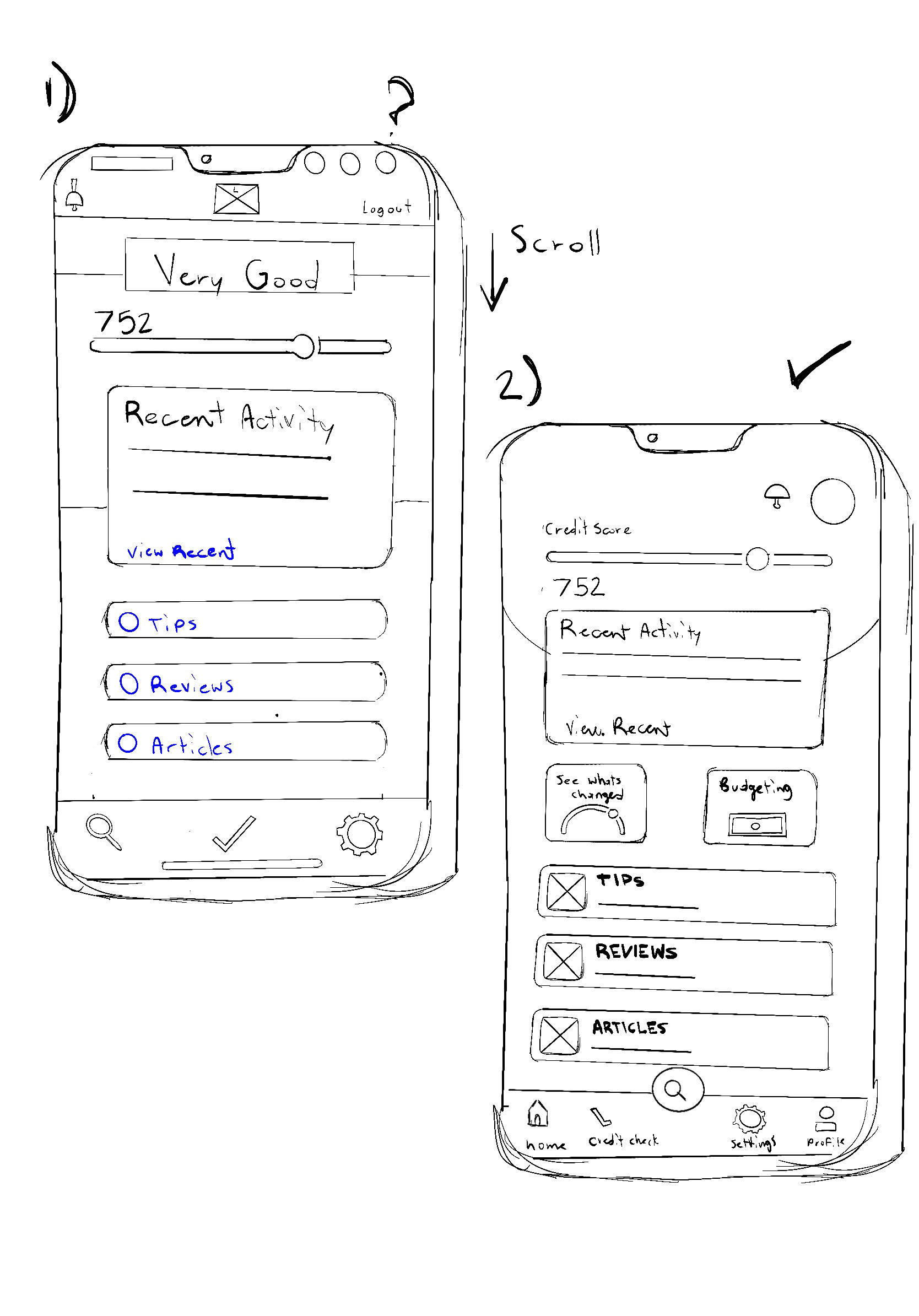
Wireframes
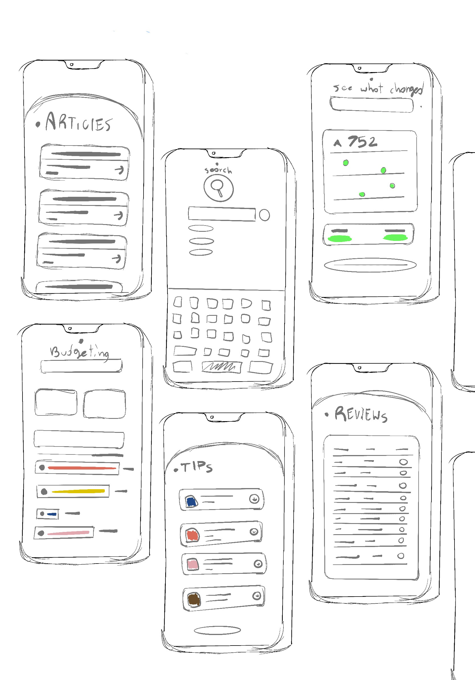
The wireframing phase resulted in many ideas, but the challenge laid in translating sketches into digital reality. High-fidelity wireframes underwent rigorous iterations, aligning with the application's guidelines.
• Explored various low-fidelity wireframes and iterated based on feedback.
• Aligned created an organic brand while also ensuring consistency with the guide.
.Test
Prototype
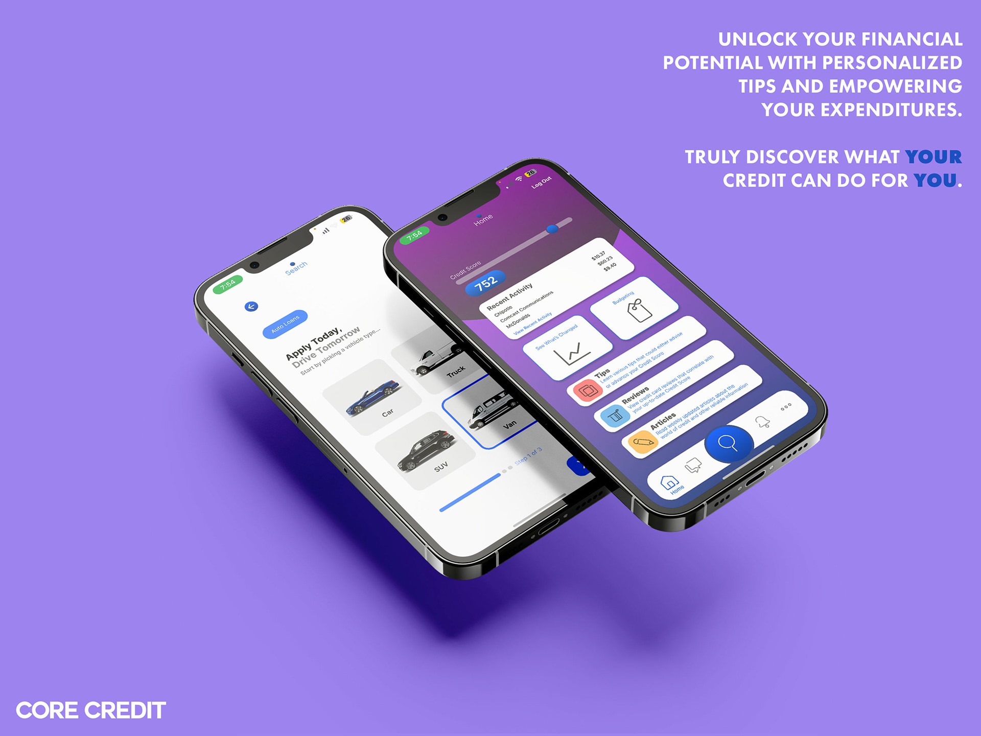
I made an interactive prototype, offering a glimpse into the user experience. Prototyping posed challenges, particularly in configuring the UI to be different yet familiar to users of all age groups. The research that was done beforehand truly helped with that process, making the prototype less difficult to conjure than it would've originally been.
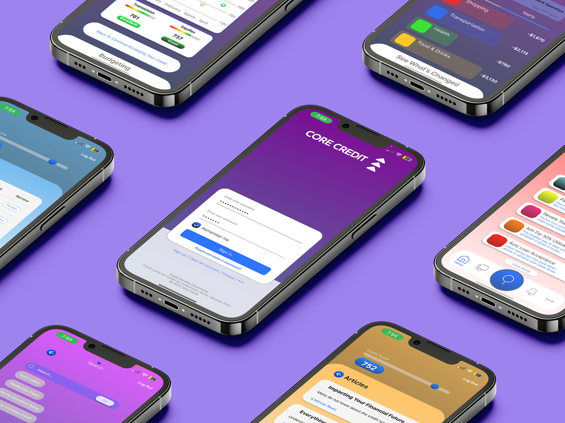
INTERACTIVE REPRESENTATION
.Final Designs
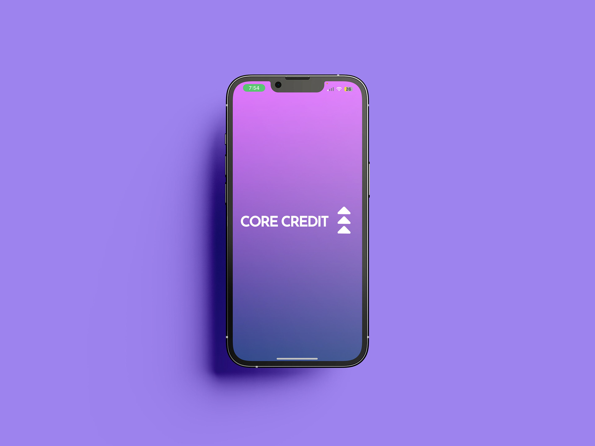
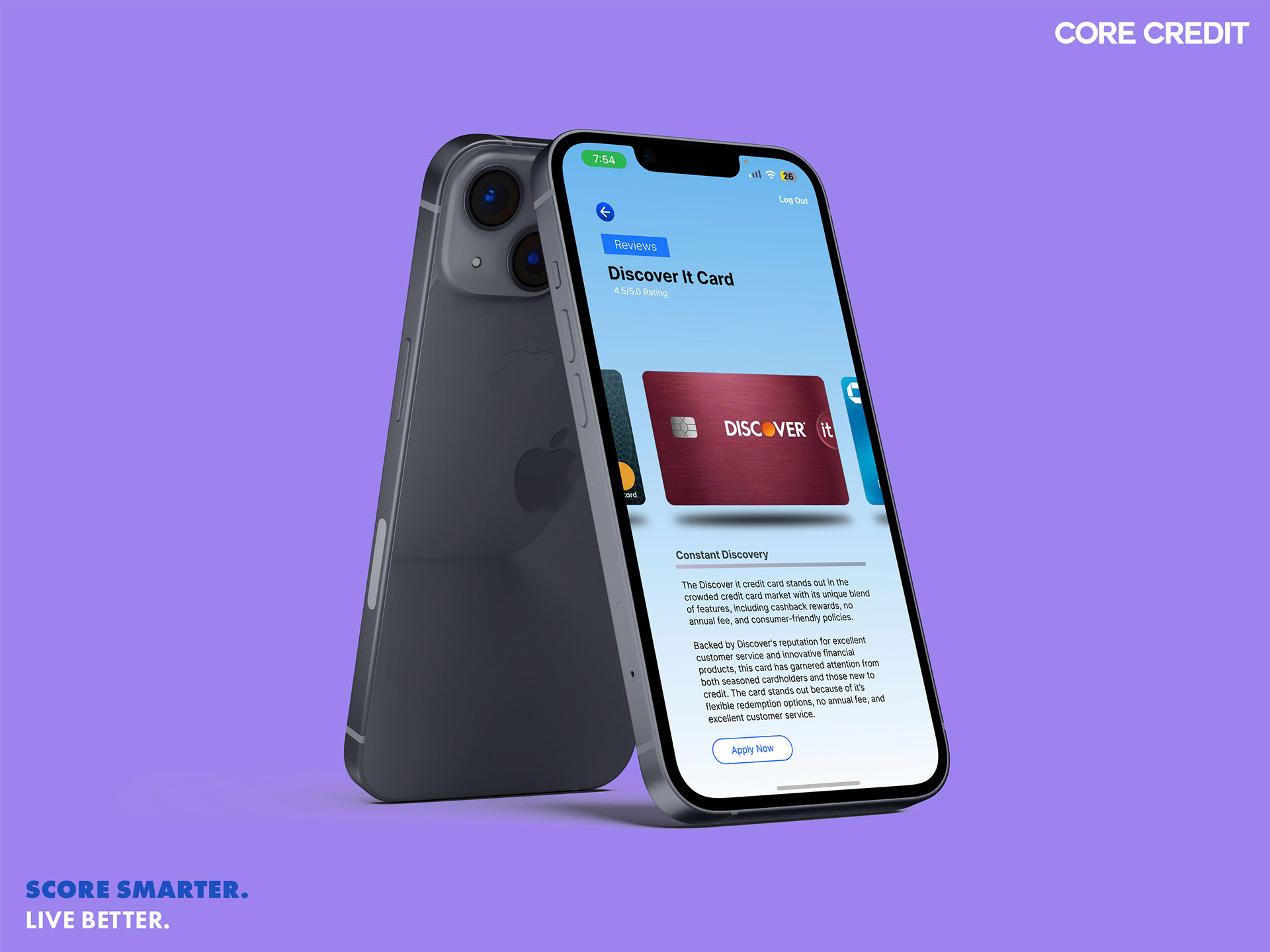
Here is a final iteration of CORE CREDIT™, the app that offers comprehensive features to help & manage one's credit score journey.
.Reflection
Next Steps For This Project
• Develop a more fully functional prototype for more realistic testing scenarios.
• Conduct in-person usability tests with more complex tasks to simulate real-world scenarios.
Challenges Faced
• Iterations in high-fidelity wireframes demanded more time than anticipated.
• Prototyping complexities.
• User experience bugs & responsiveness
What I learned
• A responsive design adapts to different user contexts & needs, making the app more versatile.
• Regular user testing & feedback loops help in refining the app to better meet user expectations
• Users appreciate personalized insights & tips tailored to their specific financial situations
Conclusion
The development of the application has been a journey centered on empowering users to take control of their financial health. I'm committed to continuous improvement, leveraging user feedback to refine & enhance CORE CREDIT™ to it's full potential. Truly understanding user needs & preferences are just as crucial as the backend & frontend work of any application, so learning that (the hard way) was needed for serious character development and I'm not afraid to say that. Learning that you aren't always right in a situation can be hard to grasp for many people (including myself) but once you get over that hump of unbiased opinion, you will grow into a fine designer. Moving forward, the experience gained will undoubtedly influence my approach to future projects.
Thank you for exploring this case study!